
The very first land visitors ever encounter when crossing into the happiest place on earth is quite a pressure-filled position. Main Street USA has to instantaneously transport you from everyday life into the world of yesterday, tomorrow, and fantasy. As you can imagine, that means Imagineers put tremendous care into designing this important land. Through the concept art, you can see how these ideas took shape – and it’s remarkable how much of the original concept art closely mirrors the final result.
Let’s start at the entrance. You see the train station towering over a hill, with Mickey welcoming you into a new world.
 Source: Blogger | User Content
This image may differ in details like color and the fact that “Disneyland” isn’t written in the garden, but the overall shape of the space is virtually identical to the final product.

This entryway (which I wrote more about here), serves as an important transition space as you move into the park. And on the other side, it becomes a barrier protecting you from the outside world.
 Source: Disney Park Concept Art
?file=Disneyland_Railroad_Concept2.png#Disneyland_Railroad)
This concept art deviates a bit more from the final product. The design of the train station is a little bit off, plus the scale of the station is much grander than what appeared in the park.

A detail I find particularly interesting is the entrance tunnel at the center, instead of on either side. Without that central entrance, you have to turn a corner to see the castle, which I think is a very cool visual moment.
On the western side of the street, concept art depicts a lot of activity, with shops, carriages, the trolley, and bustling crowds.
 Source: Walt Disney at Disneyland
The trolley, basic architecture, and even some of the shops came to fruition. Today, the center building is home to the Fortuosity Shop, and the building opposite is the Carnation Cafe.

But of course, like all things Main Street, the final product is much more compact without the breathing the concept art has. You’ll see a similar result with the depiction of center street’s concept art.
 Source: Pinterest
And the final product, which shrinks the scale. Though I will say, this area does a great job of maintaining an open courtyard feel without much real estate to work with.

I’m not 100% sure which part of the street this image is supposed to depict; my best guess is the western side from Carnation Cafe to the Refreshment Corner.
 Source: Walt’s Folly
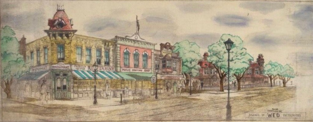
You can see the color scheme, presence of trees, and of course the gas lamps all made their way into the park.

On the opposite side of the street, the concept art is a little bit more colorful. Here you can see a lot of details that absolutely came to life…just in different locations. Note the Crystal Arcade (now across the street), the Photo Supply store (flipped to the other end by the castle), and the drug store (also moved across the street).
 Source: eBay
Instead, this side of the street features a coffee shop and the Main Street Cinema, among many other little stores.

In the end, the Main Street USA collection of concept art isn’t nearly as theoretical as other lands, but it’s not quite an exact blueprint either. It’s almost like this one was a puzzle, and Imagineers just moved different elements around to different places until they found the perfect picture.